
Intro
The company had just raised a Series A and consisted of 14 employees when I joined as the founding designer. I closely partnered with engineers, domain experts, and the CEO. In the absence of a PM, I facilitated workshops using Miro with the team to shape a product roadmap while leading end-to-end product design from research to final implementation. My work in this case study includes the new landing and navigation, role-based access control (RBAC), and data management experiences based on the product roadmap to meet high-impact user and business requirements. Beyond product design, I established the design function by introducing a UX hub on Notion for collecting, organizing, and sharing user and UX design insights, a collaborative product design and development process, and building the company’s first design system to support scalability and operational excellence.
Team
CEO
Jonathan Wang
Lead UX Designer
Jae Choi
Software Engineers
Andrew Wright, Rachel Tang, Katherine Xiao, Angela Hsieh
Domain Experts (Bioinformaticians)
Argus Athanas, Naba Naufer, Hillary Tsang, Michael Lafferty, Rebecca Panitch, Andrew White
My Roles
User Research
Semi-structured Interview, Affinity Analysis, Shadow, Persona, Journey Map, User Testing
Product Strategy
Impact vs. Effort Workshop
Prototyping
From Concept to Implement-ready
Design System
From Zero to One
Impact
67% increase in task completion rate, 33% decrease in user onboarding training time, and accelerated time-to-value from 6 months to 2 months.
Time
10 weeks
Intro
Watershed Bio is a cloud computing and data analytics platform for scientists to analyze biological data. My role in the company was to lead the end-to-end design process, from user research to implementation, along with engineers, internal users, and the CEO. This case study highlights my contributions to product strategy, key design decisions, and the overall design process for three key experiences I designed: the landing and navigation, role-based access control (RBAC), and data management.
Team
CEO
Jonathan Wang
Lead UX Designer
Jae Choi
Software Engineers
Andrew Wright, Rachel Tang, Katherine Xiao, Angela Hsieh
Bioinformaticians
Argus Athanas, Naba Naufer, Hillary Tsang, Michael Lafferty, Rebecca Panitch, Andrew White
My Roles
User Research
Semi-structured Interview, Affinity Analysis, Shadow, Persona, Journey Map, User Testing
Product Strategy
Impact vs. Effort Workshop
Prototyping
From Concept to Implement-ready
Design System
From Zero to One
Impact
67% increase in task completion rate, 33% decrease in user onboarding training time, and positive user feedback
Time
10 weeks
Users
There are two primary user groups. The first is internal bioinformaticians, whose main objective is to create customized scientific workflow templates (Figure 1) for clients. These workflows function like mini tools with user interface for data analysis (Figure 2). The second user group is clients, typically wet-lab scientists, who often lack advanced programming skills. With the help of these workflow templates and support from internal bioinformaticians, they can analyze large-scale biological data without needing to write code.

Figure 1. Internal bioinformaticians goal is to produce scientific workflow templates base of Jupyter Notebook.
.svg)
Figure 2. Scientific workflow templates allow users to analyze their own data without code by producing built-in UIs such as sliders.
Problem
Clients rely heavily on internal support from start to finish using the product. This caused inefficiency for the both user groups at business costs.
Goal
Make a self-serve product for clients.
Product Strategy
The very first step was to understand the product vision from the CEO, identify critical user experiences, and understand engineering constraints. Given the nature of an early-stage startup, I actively contributed to shaping the product roadmap in collaboration with the CEO, internal users, and engineers. Through user research and workshops I facilitated, we identified three key areas as the pills below to address to achieve our goal of building a self-servable product.
Figure 3 illustrates the initial user workflow for clients from selecting a workspace to uploading data and accessing scientific workflows. Users frequently encountered friction at the very first step, often uploading data to the wrong location. This posed a critical UX issue, especially considering the anchoring effect: when users struggle early on, they tend to perceive the entire product as difficult to use. Acknowledging the importance of this first-touch experience, I secured buy-in from the CEO to lead an initiative aimed at improving the onboarding flow.
.svg)
Figure 3. (1) selecting a workspace (2) opening a data upload modal (3) uploading raw data (4) importing the raw data (5) reviewing the imported data (6) accessing scientific workflows in the Notebook file directory on the right.
To understand overall user needs and pain points, I gathered and consolidated user feedback from multiple channels, including surveys, interviews, and shadowing (Figure 4).
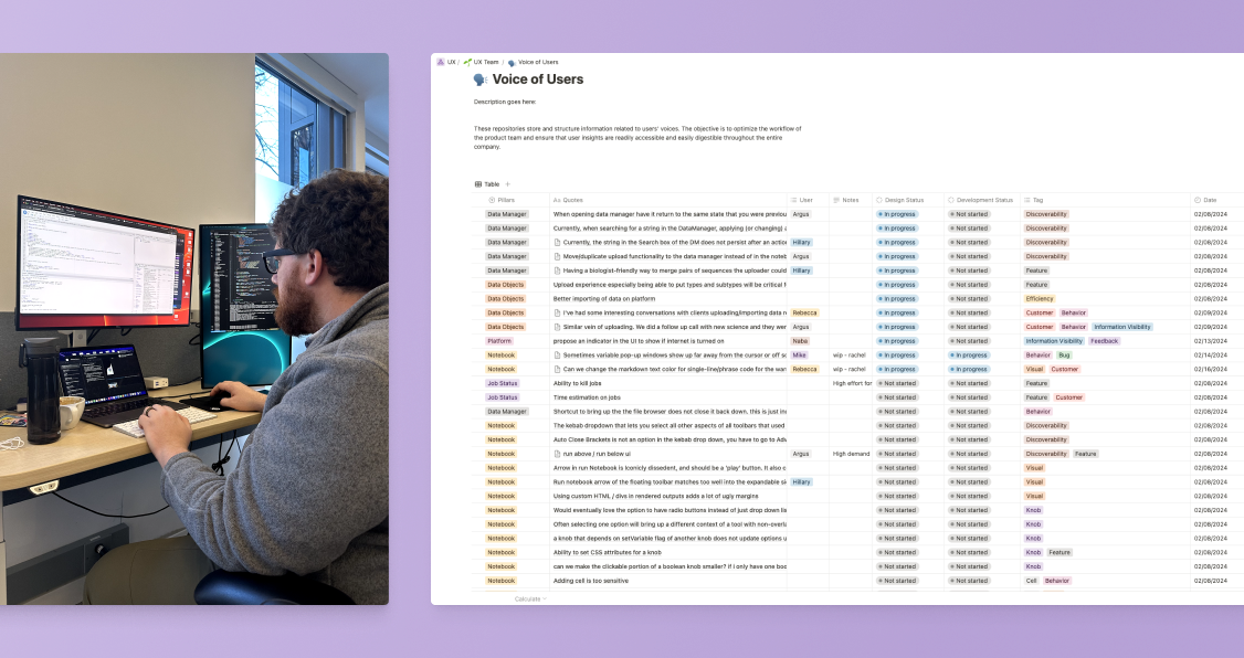
Figure 4. Having user insights consolidated with product categories, direct user quotes, and screenshots helped me empathize with them and clearly understand their needs and pain points.
After identifying themes across user insights, I facilitated impact-versus-effort workshops with internal users, engineers, and the CEO to prioritize high-impact problems (Figure 5). I prepared a Miro board with four quadrants and sticky notes describing potential projects. The Internal users first mapped the projects based on impact and effort. Then I synced with the engineers to refine the effort estimates for greater accuracy. I then shared the results with the CEO to identify high-stakes problems aligned not only with user needs, but also business needs.

Figure 5. Live workshop with impact-versus-effort quadrants.
At the time, the business was focused on finding product-market fit, which led to deprioritizing visual design. As a result, the product lacked consistency in its UI elements and patterns. Button sizes were arbitrary, primary colors included conflicting shades of blue and purple, and typography lacked a clear hierarchy and consistent use (Figure 6). Additionally, the open-source Uber Base UI component library we initially used to build the MVP were neither scalable for our product vision nor customizable for our brand. In some cases, UI elements were hard-coded instead of using the component library, which hindered both user experience and the product team's ability to move quickly and accurately. Recognizing that well-crafted UI could serve as a competitive advantage in the life sciences space, leveraging the Halo effect, I secured buy-in from the team to address these issues in parallel with key feature development.
Figure 6. The absence of a defined design system led to inconsistent user experiences and slowed down product launch timelines.
Success Metrics
To evaluate whether our strategy successfully supported the goal of making the product self-servable, I chose to measure the task completion rate of our internal bioinformaticians. They were spending a significant portion of their day assisting clients with basic tasks, limiting their capacity to focus on core responsibilities. My hypothesis was that, by improving client self-servability, the bioinformaticians would regain time and increase their productivity. Therefore, task completion rate was chosen as the key quantitative success metric for this initiative.
Implementations
With Northstar vision in mind for the future-proof and scalability, I successfully shipped the first implementations.
While backend stays the same, I redesigned the front-end and information architecture for enhanced user experience. This new design focuses on the experience of selecting a project through the cards you see, which is the first step of their workflow. I removed all other information that was not needed for this step. This way users could have clear idea of what to do, and where they are at in the platform as they navigate through. I believed that this first-touch experience would lead to simple success path that provides positive first experience and perception of the product.
Before
.svg)
Figure 7. Previous landing page; clients were set to fail from the beginning due to information overload, lack of guidance, and frequent context switching.
After
.svg)
Figure 8. New landing page with sidebar that focuses on the very first step of a user workflow, selecting a workspace.
Northstar Vision
.svg)
Figure 9. Long-term vision of landing page that provides capabilities of platform-wide communication, workspace management, and RBAC.
Previously, the UI didn’t support cross-workspace data sharing. Internal bioinformaticians had to use the terminal to move data for clients, an error-prone and unsustainable solution. Moreover, I learned the whole data manager was barely usable through user interviews. So rather than patching a broken system, I decided to redesign it from the ground up, including data sharing capability.
Before
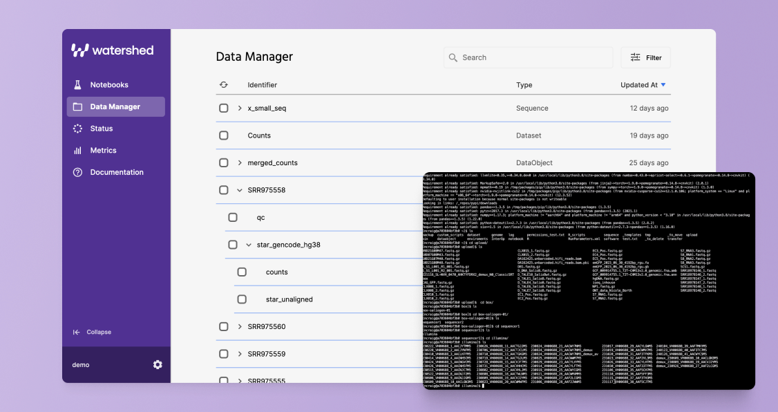
Figure 10. Previous Data Manager page; internal bioinformaticians had to use a terminal as a work around to share data across workspaces.
After
.svg)
Figure 11. New Data Manager page that enables efficient and secure data sharing across workspaces.
Northstar Vision
.svg)
Figure 12. Long-term vision of Data Manager page that fulfills robust needs of users around data handling throughout their journey.
Regarding the RBAC designs, previously, user account and permission management had to go through company support—slow and unscalable. The settings page also looked unfinished, which hurt credibility. I saw this as an opportunity to improve both RBAC and the settings UX.
Before
.png)
Figure 13. Previous Settings page; not only the UI looked unfinished to harm credibility of the product, this page was not functioning.
After (User Management)
.svg)
Figure 13. New Settings page with user management features for admin users.
After (Project Management)

Figure 14. New Settings page with project management features for admin users.
Northstar Vision
.svg)
Figure 15. Long-term vision of Settings page that has more configurable settings.
While working on these initiatives, I was also testing and documenting scalable design patterns. Through this process, I delivered a cohesive, reusable design system to improve usability and consistency.
.svg)
Figure 16. Company’s first design system.
Process Behind
After scoping the project with my team, I begin by discussing feasibility and constraints with engineers and internal bioinformaticians through visual explorations. I then ideate and develop interactive prototypes for user testing, and finalize the validated designs with the CEO before moving to implementation.
① Engineering Alignment
During the meeting with engineers and internal bioinforamticians, we chose project-level sharing over user-level, understanding the system limitations.
.svg)
Figure 17. Low-fidelity prototypes to discuss concept of new landing page and sidebar progressive disclosure.
② Ideation
Understanding the engineering constraints, I put workspace description in the card as I build the prototype. Then I added elements like platform-wide communication, project management, and RBAC capabilities on the new landing page for the long-term vision based on product roadmap and stakeholder inputs.
.svg)
Figure 18. Landing page prototype designed for scalability, incorporating feedback from engineers and stakeholders.
③ Validation
I ran user testing with half of the internal bioinformaticians. The main task was to locate a specific notebook and I measured how long it takes for them to locate it. I observed that users tried to search for notebooks, and confirmed that direct access would benefit clients. So I iterated the card to include clickable notebook files, allowing users to open notebooks directly without navigating through directories (Figure 19). Initially met with engineering pushback due to deprioritization, but after demonstrating a 220% efficiency gain in the second round of testing with the other group of bioinformaticians, I shared the results and secured implementation.
.svg)
Figure 19. Providing direct access to notebook files improved user efficiency by 220% in testing.
After the internal release, I shadowed real usage sitting next to the bioinformaticians. I noticed users only clicked directly on the notebook when computation was running. Otherwise, they clicked the card edge to access the workspace. So I iterated further before the final release and introduced a ‘Nested Notebook’ concept which expanded only when computation is in progress, and collapsed otherwise (figure 20). This gave users bigger space to click accurately and faster.
.svg)
Figure 20. Nested Notebook design expands files during active computation and keeps them collapsed otherwise.
① Engineering Alignment
During the meeting with engineers and internal bioinforamticians, we chose project-level sharing over user-level, understanding the system limitations.
.svg)
Figure 21. Exploring engineering constraints and aligning on product direction for data sharing.
② Ideation
Next, I conducted in-depth interviews with all internal bioinformaticians and ran an affinity analysis to synthesize the insights. This helped me uncover their mental models, needs, and pain points related to data handling.
.svg)
Figure 22. Affinity analysis revealing common patterns in user needs, pain points, perceptions, and behaviors related to the Data Manager page.
③ Validation
Next, I conducted user testing alongside component-level UX evaluations to assess the new Data Manager page design (figure 23). After iterating based on user feedback, I aligned with the team and CEO to finalize the product.
.svg)
Figure 23. Scenario-based testing and component-level UX evaluation to assess key features and user flows in the redesigned Data Manager page.
① Engineering Alignment
During the meeting with engineers and internal bioinformaticians, we defined roles and permissions in the platform which admin users can control.
.svg)
Figure 24. Exploring engineering constraints and aligning on product direction for role-based access control.
② Ideation
As we defined the RBAC requirements, the next step was to explore how the settings could scale in the future. I brainstormed with the CEO and internal users to identify potential use cases for the settings. As exploring multiple settings pages, I defined consistent UI patterns for settings components.
.svg)
Figure 25. Exploring potential future use cases for Settings helped inform the definition of consistent UI patterns for the feature.
③ Validation
Next, I explored two industry standard navigation patterns for Settings. One used a deep hierarchy on the left, and the other a flat hierarchy on the right, as shown in Figure 26. After consulting with our admin director, I chose the flat structure because it made configuration validation more straightforward and allowed for quicker information retrieval using Cmd+F, which was essential to his workflow.
.svg)
Figure 26. A/B testing two navigation patterns: deep hierarchy vs. flat hierarchy.
By understanding the product needs, the importance of brand customizability, and our goals for community engagement, I chose to use Mentine UI, an open-source component library. After aligning with my engineering team, I then imported these components into Figma and built a comprehensive component library. From there, I tailored the components to align with our brand’s direction, aiming for a neutral, straightforward UI, and refined them to establish a design system grounded in current best practices.
Results
After three months of launching and collecting data, I observed a 67% improvement in task completion rates, onboarding time was reduced by one-thirds, and we received positive feedback from both user groups through direct comments and interviews.

Reflection
Throughout the design process, I encountered misalignment between engineers, the CEO, and myself. I had to frequently change my design to adapt to shifting engineering directions, which created inefficiencies and slowed down the project delivery. To address this challenge, I formalized a design process and aligned expectations across teams (Figure 27).
.svg)
Figure 27. Newly defined product design/development process.
Moving forward, whenever I synced with engineers and the CEO, I introduced a process slide at the beginning of each discussion to outline our current stage (Figure 28). This helped engineers and stakeholders understand when critical decisions needed to be made before moving on.
.svg)
Figure 28. Newly defined product design/development process.
I learned that being a designer is not just about crafting good designs but also about establishing a strong process and maintaining active communication to bring solutions to life.